Here I have created a mood board for my target audience. By creating a mood board it gave me a much better understanding of who my audience are, and the types of things that they like. In addition to this it will help me when creating my magazine as I would have a much better understanding of the interests of the audience and therefore would be able to incorporate this into the magazine. Not only did I get images of the things that the audience like, I wrote a thorough analysis of why I had chosen particular images, and given a detailed explanation of who the audience are so that when I go onto creating my magazine I know exactly who I am targeting the magazine to.
Monday 30 September 2013
Wednesday 25 September 2013
Preliminary Task Analysis Video
Tuesday 24 September 2013
Preliminary Task Evaluation - 24th September
Evaluation - 24th September
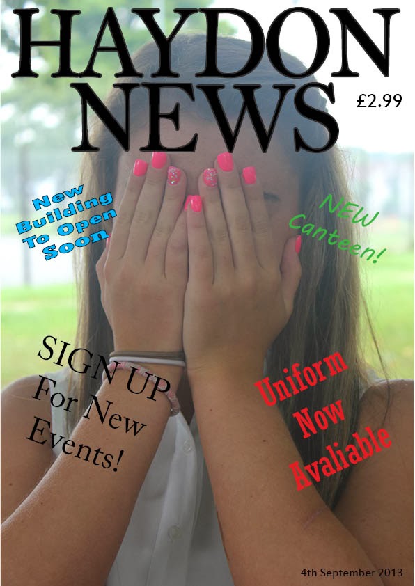
When I began making my magazine for the preliminary task I thought about a suitable colour scheme and also suitable fonts and titles. I gave my magazine the name of Haydon News as I thought this puts across clearly to the audience what the magazine is about and who the magazine is aimed at. Furthermore I used a bold font for the title and had the letters in a black and uppercase font. This made it stand out clearly to the audience so they could clearly see the name of the magazine. I also made sure that the name of the magazine was the biggest text on the page so that it catches the buyer’s attention and will make them want to buy the magazine. I did not only make sure that it was just the name of my magazine that was clear to read but I made sure that the other text on the front cover was of suitable fonts and colours to make it appeal to the audience. I placed the cell lines around the edge of the magazine so that the image is clearly in the middle of the page and catches the reader’s attention and makes them want to carry on reading the magazine. When I was thinking about the image I wanted to use for the front cover of my magazine I thought about the purpose and target audience for the magazine and then decided on the image I used for my front cover. I thought this was a suitable image choice as it is a close up image which is more suitable than a long distance shot for the front cover. Also the image being of a Haydon students makes it become clear to the audience that the magazine is aimed at Haydon pupils. I also included the price of the magazine on the front cover to allow the buyer’s to see how much the magazine costs. However once I had created my preliminary task I realised had not included some of the main features that are on a magazine such as the barcode and date, however I know for the next task that I need to include these.
To make the magazine I created better I would have added more detail and added more of the key features of a magazine such as the barcode. I also would have shown more skills of using the software to make my work look more appealing and more professional. I also would have used a wider range of camera shots and camera angles to make it more interesting for the audience to look at.

Friday 20 September 2013
Preliminary Task - Sketches
These are my sketches for my preliminary task. I have drawn out roughly how I want my magazine to look when I make it including the front cover and the contents page. I have included all the main things which I thought needed to be included in my magazine front cover / contents page.


By doing these sketches I now have a much better understanding of how I want the magazine to look. Not only this but it now means that when I go onto creating the magazine I will know where to start rather than not having any ideas.
By doing these sketches I now have a much better understanding of how I want the magazine to look. Not only this but it now means that when I go onto creating the magazine I will know where to start rather than not having any ideas.
Wednesday 18 September 2013
Preliminary Task
Media Studies
Preliminary Task Log - 18th September 2013
Over the past two weeks I have gained information on how to create the preliminary task of making a front cover and a contents page for a school magazine. In our first lesson we looked at previous preliminary tasks created by other students and other students final task completed. We looked through a range of student’s blogs to see what they had created for their preliminary task which enabled me to gain knowledge on what I had to do for the preliminary task and also gave me ideas of designs of which I could use for the task. We also discussed as a class what each preliminary task had which makes it appeal to the target audience being school children and what they had included that did work so well. This allowed me to know what I should and what I shouldn’t include in my magazine to make it appeal to as many people as possible. When looking at these examples it helped me to decide what sort of images I would want to use for my front cover and contents slide. We also looked at the students work from their preliminary task to the final piece of work they created. This enabled us to see how much the students improve over the year of studying media and how you can create the most professional looking magazines. It also gave us an insight to what we will be doing throughout the year and what work we will have to complete.
In the next lesson we went outside of the classroom in groups of 3 to take some pictures which we would be using for the preliminary task. We took a range of pictures around different locations of the school, to ensure we had enough pictures to choose from when making our cover and contents page. We spoke about the images and discussed which ones would be good to use to ensure that the cover appeals to as many people as possible. I also made sure I had a range of images around different locations of the school including outside buildings, inside the school and on the school field, to ensure that my front cover and contents page did not include any of the same images as this may have made it become boring and unappealing to the audience.
In the following lesson I began to draw out my preliminary task onto paper drawing out where the images and text would go. By drawing it out it helped me get an idea of what it would look like when I had finished it on the computer. Firstly I drew out the front cover. When I was drawing this I made sure that I included all the main features which you see on the front of a magazine. This included the headline which I made big and bold so that it stood out, the price, date and other key features such as the images and what will be included in my magazine. I decided to use a close up image on the front of my magazine of a person as this would suit the target market of being the students at school and would also make it a lot easier to tell that it is aimed at the students at Haydon. I then went on to drawing out my contents slide. I made sure I had the heading ‘contents’ at the top of my page and then a few pictures and then what is included on each page in my magazine. I made sure that when I drew out my contents page that it was not too over crowded with text and images.
In the next lesson I began to make my magazine cover and contents page on the computer. I began by making my front cover. Firstly I found the image I wanted to use on the computer and placed it in, then positioned it and resized it so it fit correctly filling up the whole page. I then added the name of the magazine at the top of the page and made the font in upper case and in bold so that it would stand out. I made sure that the font suited the purpose of the magazine and also so that it appeals to the students and will make them want to read it. I added onto the front cover some of the main stories which would be included in the magazine and changed each one so they were different colours and font styles. By making them different font styles it made it look brighter and more appealing to the target market. Finally I added the date, and price to my front cover to make it look more professional. I then went on to make my contents page. This involved finding 3 suitable pictures to have on my contents page and adding in text to allow the audience to see what is included in the article. I firstly added the title at the top saying ‘contents’. I made this the same style as the title of the name of the magazine on the front cover. By doing this is makes it look more professional and more realistic. I then decided that I would use two images of the school one of the front building and one of the building work, and then one image of a Haydon student. The range of images will allow people to see what will be included in the magazine and make it look more appealing. When I added the text for what is included in the magazine I made sure that the font was clear and readable for the audience.
Subscribe to:
Posts (Atom)